Introduction
Decision trees are a powerful tool in data science that help us make sense of complex data and make informed decisions. Imagine you’re trying to decide whether to go on a picnic. You might consider factors like the weather, the day of the week, and whether your friends are available. A decision tree helps you visualize this decision-making process by breaking it down into a series of simple yes-or-no questions.
In data science, decision trees are used to predict outcomes based on various input factors. For example, a retailer might use a decision tree to predict which customers are most likely to buy a new product based on their past purchasing behavior. The tree starts with a single question, such as “Has the customer bought a similar product before?” Depending on the answer, the tree branches out into more specific questions until it reaches a final prediction.
One of the great advantages of decision trees is their simplicity and ease of interpretation. Unlike other complex algorithms, decision trees provide a clear, step-by-step path to understanding how a prediction is made. This makes them particularly useful for explaining data-driven decisions to non-technical stakeholders.
Overall, decision trees are a versatile and intuitive tool that can help businesses and individuals make better, data-informed decisions.
Example: Home Valuation

Imagine we have a dataset containing home price information for four houses, with additional information on features like the number of bathrooms and the square footage of each house. Imagine we also want to use a decision tree to show what features are important, in order of importance, to determining the price of each house . Putting the data into a decision tree algorithm could produce the following image.
Exploring the Tree
Root Node: The tree starts with the feature at the top of the image called the “root node”. This feature is made up of several components:
- Logical Statement: The root node, like all other decision nodes within the diagram makes a logical statement. In this example, when scrutinizing data associated with this analysis, the algorithm found that the most effective variable for splitting the population of houses being analyzed into higher and lower home value categories, was the number of bedrooms within each home. Moreover it found that the most effective cut point for making this split was when the number of bedrooms in the home was less than or equal to 2.5. This form is the basis for the logical statement displayed in this node.
- MSE: Mean squared error. This number represents the average error in the value estimate shown below, squared. It is a very large number in this case, because the home prices in this example are relatively large numbers. Moreover, it indicates that there is a fair amount of variation in value around the stated average home value. Taking the square root of this mean squared error value gives us the standard deviation around the mean: $100,374
- Samples: The number of records (i.e. “homes”) included in this analysis
- Value: The $325,000 value listed in this note represents the average home value, of all of the four homes analyzed.
Decision Nodes: Nodes within the tree that later split into other nodes are called “Decision Nodes”. The root node is a type of decision node. Logical statements indicating how to navigate the decision tree are shown within each node. Note that when examining the logic in a decision tree node, the “TRUE” answer to a conditional statement is always shown to the left of that node. The “FALSE is always shown to the right.
Looking at the root node, it says that if “Bathrooms <= 2.5” is TRUE, then the average value of the home is $273,333 (the average for the node to the left). If “Bathrooms > 2.5” then the average value of the home is $480,000 (the average for the node to the right). This same way of interpreting the content, with the TRUE path going to the left, and the FALSE path going to the right, can be applied to all of the other Decision Nodes.
Leaf Nodes: Like leaves that exist at the end of branches on real trees, leaf nodes in the above diagram are nodes that do not split further. The leaf nodes in this example contain the final house prices. In this example, if a house has “Bathrooms <= 2.5” AND “SquareFootage > 1250” AND SquareFootage <= 1550, then the house price is $300,000. One home in the analysis falls into this category, and given that the mse = 0, this tells us that its price was exactly $300,000.
HERO Decision Trees
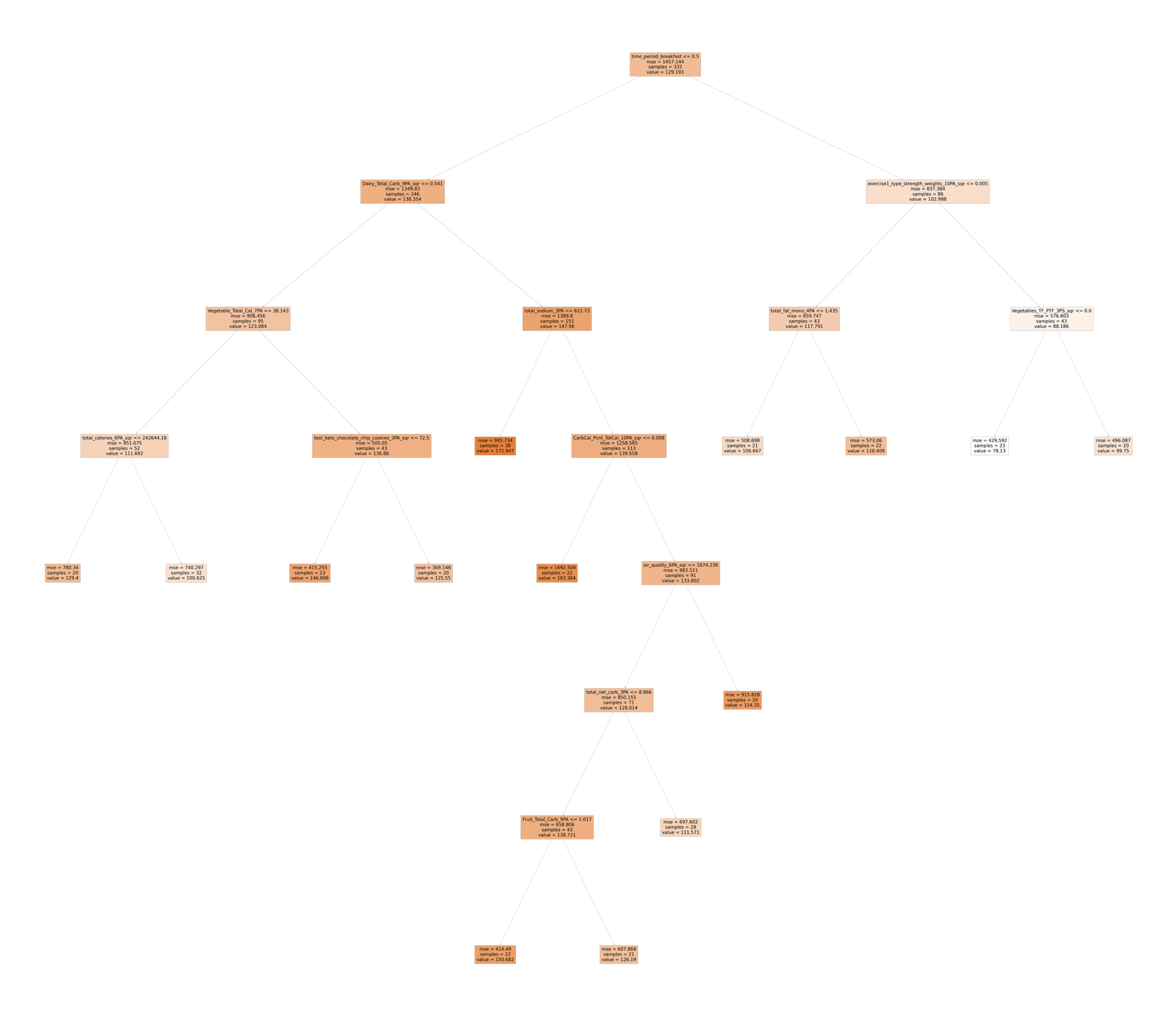
HERO Decision trees are quite a bit larger. They’re also based on vastly larger amounts of data than what was shown in the above simplistic real estate example. Rather than using just two variables like we did to attempt to predict home prices in the above example, HERO data science workflows leverage over 12,000 variables to predict blood glucose levels for any given time period. This exhaustive analysis includes examining total and average amounts of food consumed, by type, by nutrient content, over various historical periods of time, and more, combined with a large variety of similarly detailed environmental, lifestyle, and medication data. Here’s an example:
The heirarchical nature of this diagram provides readily interpretable insights into those factors, both individual factors and combination of factors, that drive variation in blood glucose levels.
Analyzing The Tree: The Root Node

The root node for this tree shows that the average blood glucose level, across all 332 entries in this analysis, was 129.193. The mean squared error around this average is 1457.144. Taking the square root of this figure gives 38.17, which is the average variation (a.k.a standard deviation) around this mean. That is to say “the average blood glucose in this data set is 129, but in general the actual blood glucose levels varied around this mean by about 38 points”.
Logical Statement: Blood glucose measurements within the HERO app are taken at specific named points through each day. For example, “Morning, Post-Morning, Breakfast, Post-Breakfast, Lunch, Post-Lunch, Dinner, Post-Dinner, Bedtime, Night”. Each of these time periods are represented within the data as a binary (0 or a 1) digit. For example, is a particular entry for “Breakfast”? If so, time_period_breakfast = 1. If not, it’s time_period_breakfast = 0.
The statement within this root node indicates that if time_period_breakfast <= 0.5 (i.e. time_period_breakfast = 0, that is to say that it’s not breakfast time ), then the average blood glucose level is 138.354. If time_period_breakfast > 0.5 (i.e time_period_breakfast = 1), then the average blood glucose level is 102.988. Given that “time_period_breakfast” is at the root node, this indicates that whether or not it’s breakfast time is the biggest discriminator between high and low blood glucose levels within the data analyzed.
Analyzing the Tree: Non-Breakfast Entries
(The left half of the tree)

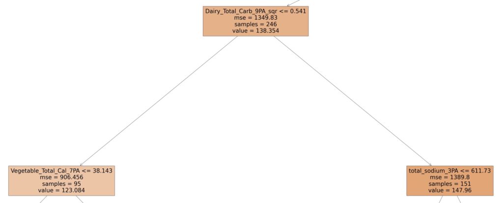
As mentioned, the average blood glucose level for non-breakfast entries is 138.354. This is shown at the bottom of the node at the top of the above image. Looking at the logical statement contained within this node, it says that if the 9-period average of carbs derived from foods classified as dairy is less than 0.541, then the average blood glucose is 123.084 vs. 147.96. That’s a 24 point blood glucose difference! That’s good to know. While putting this specific information to use for every day practical purposes might be difficult, it would be safe to say that if one simply reduces or eliminates dairy from their diet, they would, by default, follow the lower blood glucose left hand path of this diagram. Doing so, specifically for time periods that are not breakfast, would likely have a beneficial effect on blood glucose. Simple Take-Away: Consume less dairy when it’s not breakfast
Analyzing the Tree: Total Sodium

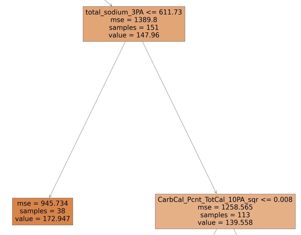
Following the right path of image 3, we see that the amount of sodium consumed is an important factor. More specifically, if 1) the time period is not breakfast, 2) if a relatively high amount of carbs from dairy is being consumed over 9 periods (Dairy_total_carbs_9PA > 0.541), then the level of salt consumed plays an important role in determining blood glucose levels. Here, if the 3 period average of sodium consumed (in milligrams) is less than 611.73, then the average blood glucose level is 172.947, otherwise the average blood glucose level is 139.558. That’s a 33 point difference! For whatever reason, salt consumption seems to play a role in processing carbs consumed from dairy. Simple Take-Away: Consume more salt, especially when you’re eating dairy.
Analyzing the Tree: Calories from Carbs As a % of Total Carbs

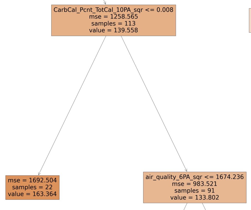
Following the right path from Image 4, we see that when 1) the time period is not breakfast [image 2], 2) when this person consumes a relatively high level of carbs from dairy [image 3], 3) they consume a relatively high level of sodium [image 4], it brings us to this split.
Here we see that when the square of the 10 period average of the amount of carbs consumed, as a percentage of total carbs is greater than 0.008, blood glucose is 133.802, vs. when this is not the case: 163.364. That’s a lot to remember. Simple Take-Away: Boiling this down to a simple heuristic, it would appear, counterintuitively, that having eaten more net carbs over the recent past (10 period average) given the preconditions mentioned above, yields a roughly 30 lower blood glucose than having not done so.
Exploring the Rest of the Tree
Exploring and discussing the other branches and nodes of this example tree would take a significant amount of time, much more than we have space for here. Still, the details of this output are invaluable and provide a very specific and follow-able roadmap of how one can control blood glucose for this individual.
It is important to note, however, that this is a snapshot-in-time of dynamics within this person’s body. Everybody, and every body is different. Moreover, any given body is different at different points in time. As different analyses are conducted over time for a person, we find that different factors and completely different tree structures emerge. Each of these reflect a roadmap to the constantly changing dynamics within a person’s body, that drive variations in blood glucose. Moreover, obtaining and subsequently following the recommendations from these roadmaps can help one successfully navigate the constantly changing dynamics in one’s body. 
Notations to Keep In Mind
Now that we’ve demonstrated the basic structure of how to interpret these heuristic/decision trees, as you look at your own tree outputs, here are some notations to keep in mind when interpreting the logic contained within the different nodes:
- PA: Period Average. Ex: “10PA = 10 Period Average”
- PS: Period Shift. This is taking the amount of something consumed or done during a prior time period, and shifting it forward by a certain number of time periods. Ex: Vegetables_TotalCarb_3PS = The total grams of vegetables consumed 3 time periods ago.
- Sqr: The square of a particular value. Ex: air_quality_6PA_sqr = The square of the 6 period average air quality.
- Sqrt: The square root of a particular value: Ex: air_quality_6PA-sqrt = the square root of the 6 period average air quality
- TC: Total Carbs
- TC PTC: Total carbs consumed as part of a category of food, as a percentage of total carbs consumed. For example, “Vegetables_TC_PTC_3PS” = the total carbs consumed from vegetables, as a percentage of all carbs consumed 3 periods ago.
- TF: Total Fat
- TF PTF: Total Fat consumed as part of a category of food, as a percentage of total fat consumed. For example, “Vegetables_TF_PTF_3PS_sqr” = the square of the total fat consumed from vegetables, as a percentage of total fat consumed, when consumed 3 periods ago.
- TP: Total Protein
- TP PTP: Total protein consumed from a particular food category, as a percentage of total protein consumed.

